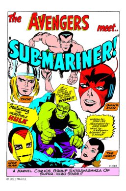
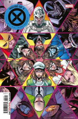
For more than 80 years Marvel, one of the most important comic book companies in the world, provided countless fans with adventure, mystery and tales of superheroes in spectacular arrangements.
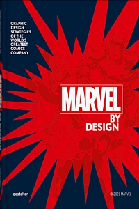 And over time, also a unique style of communication through layout was created through typesetting, lettering and altogether unparalleled design.
The easily recognizable graphic design language and its development throughout the decades are under inspection here, exhibiting hundreds of pages, details, sketches, blow-ups, changing color schemes, sentence case typography, dozens of different speech balloons and illustration captions in use over the years, as well as emanata, special fonts, and iconography.
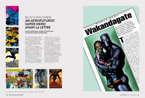 The many changes and style revolutions are carefully documented here, presented in strong visual treats on heavy photo paper that cover page layouts, logos, colors and everything else that makes a Marvel comics book immediately recognizable already at the newsstand.
As such, the finished product, its design, could evolve only in creative cooperation of layouters, inkers, letterers, colorists and pencilers.
Although such works of comic book art will come to life only in collaboration with the editors and writers, as such a large number of superhero characters had to be arranged, carefully placed and for reasons of plot and logic, be supervised in the Marvel universe.
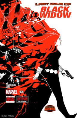 Owed to the shortage of staff at Marvel in the late 1950s with genius comic creator Stan Lee overworked in a cost-cutting company policy, Lee decided to give formerly unheard of liberties to the artists.
He was the first to break up the former hierarchy. What later would be known as the “Marvel Method” (in use roughly until the early 2000s) played a huge role in the company’s visual output.
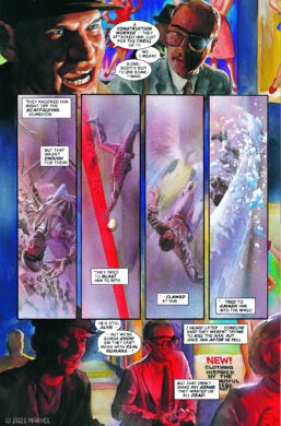 Previously most “… artists were used to writers presenting them with a rigidly formatted full script, with all the story beats and dialogue in place, but with the Marvel Method they were now given the freedom to imagine a narrative of their own choosing. … The genius of the Marvel Method was that it enabled a diversion of labor that maximized each creator’s strengths often leading to creatively satisfying breakthroughs.” The most famous proof of the success of such new responsibilities is Marvel’s Fantastic Four #1 from 1961.
Several other series and superheroes are briefly introduced concerning their time of invention, like the Winter Soldier, Captain America, Black Widow, Iron Man, Storm, Spider-Man, Black Panther, and Captain Marvel. But instead of discussing their missions and legend, the quick portraits are devoted to their changing visual evolution, outfits, and logos.
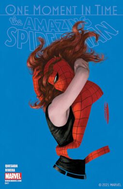 “As cultural gatekeepers increasingly accept comics as a unique art form, super hero comics – the medium’s dominant genre – are evolving in small ways to reflect their taste for realism. The square jaws and strong features so common on 1960s super heroes have been replaced by flaws and features that make them look like actual people. … It’s a reminder that comic books’ visual culture is tied to culture at large, and both are constantly changing.”
Apart from graphic design expert Liz Stinson, who provides the bulk of texts, the altogether 11 chapters plus an introduction are contributed by Mark Wilson, John Rhett Thomas, Carl Potts, Jess Nevins, Chris Eliopoulos, Mike Essl, and Paul Sahre, familiar names to any comic book fan.
Their categorizations of individual aspects of the Marvel design cover the many links and masterfully connected areas between comic book culture, pop art, graphic design, editorial design, visual culture and its absorption into popular culture.
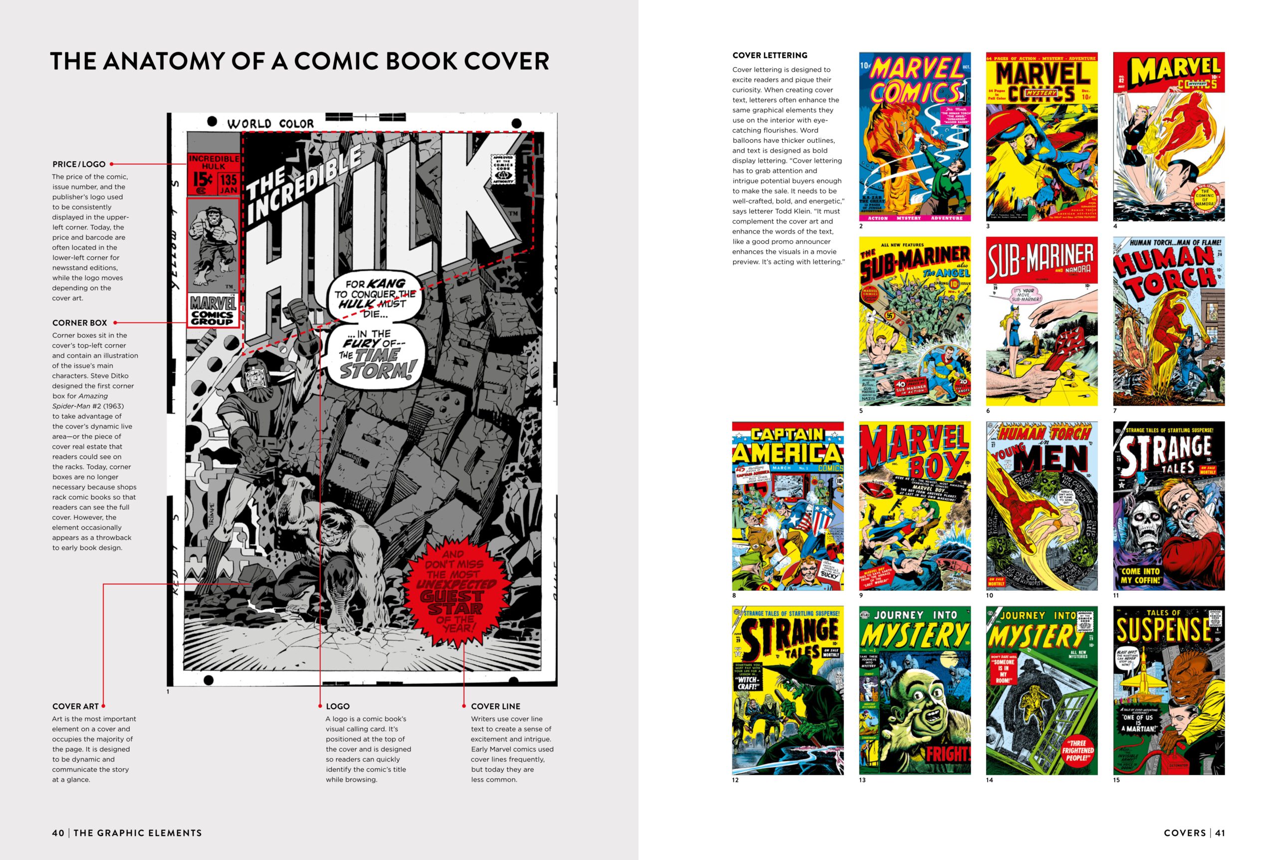 The standard stitch bound, 5 pound full color 9 x 13 inch hardcover version is available in separate editions in either English, German or French.
The special edition in English language, limited to 1,000 copies, comes in a linen bound presentation box and offers bonus features, such as three bold screen prints on heavy uncoated paper and several embroidered graphic fabric patches with designs from the Marvel Universe.
Marvel By Design is a telling visual exploration into the Marvel graphic universe, with the most intriguing parts here probably in the chapters on layout, lettering and cover creation.
Review by Dr. A. Ebert © 2022
gestalten & Liz Stinson (eds.) Marvel By Design. Graphic Design Strategies of the World’s Greatest Comics Company. Special Edition. Die Gestalten Verlag, 2021, 320 p., ISBN: 978-3-96704-049-4
gestalten & Liz Stinson. Marvel By Design. Graphic Design Strategies of the World’s Greatest Comics Company. Die Gestalten Verlag, 2021, 320 p., ISBN: 978-3-96704-026-5

